WCAG AA asks for a contrast ratio of at least 4.5 to 1 for body text and 3 to 1 for large text. Light grey on white rarely makes it.Try this today: Check your muted text colour against its background in DevTools. The colour picker shows the ratio.How a public-page review works, step by step: carlosandmunoz.com/qa-review-guide.html#Accessibility #Design #WCAG #QA #QAlab
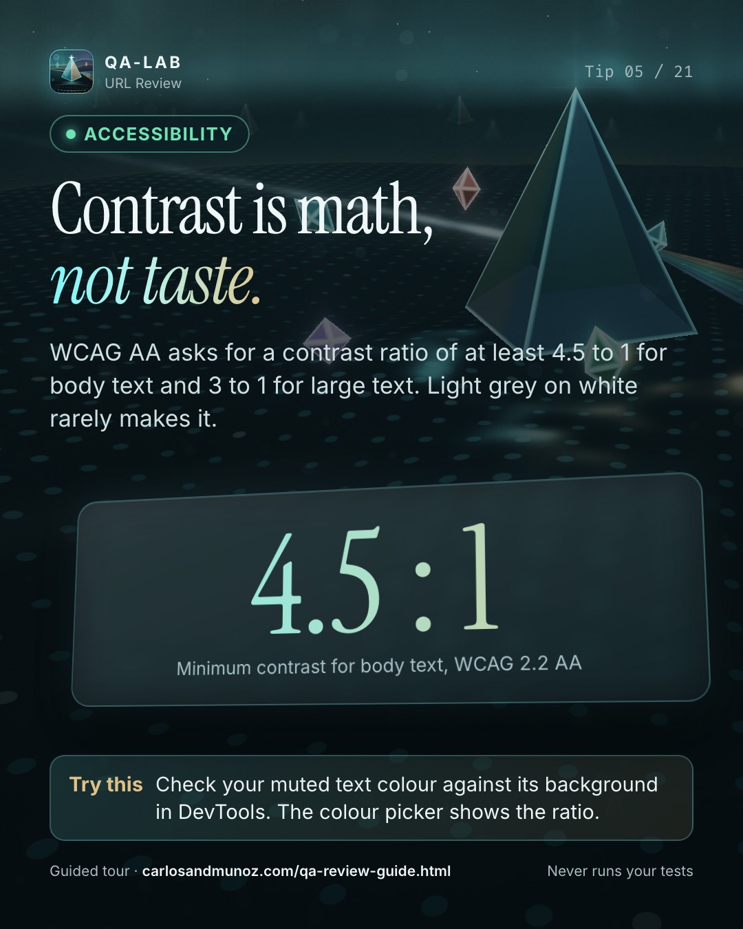
Contrast is math, not taste.

WCAG AA asks for a contrast ratio of at least 4.5 to 1 for body text and 3 to 1 for large text. Light grey on white rarely makes it.

Try this today: Check your muted text colour against its background in DevTools. The colour picker shows the ratio.

How a public-page review works, step by step: https://carlosandmunoz.com/qa-review-guide.html?utm_source=linkedin&utm_medium=social&utm_campaign=tips-2026-10&utm_content=contrast

#Accessibility #Design #WCAG #QA #QAlab
X
Contrast is math, not taste.

Check your muted text colour against its background in DevTools. The colour picker shows the ratio.

https://carlosandmunoz.com/qa-review-guide.html?utm_source=x&utm_medium=social&utm_campaign=tips-2026-10&utm_content=contrast
#Accessibility #QAlab
Instagram
Contrast is math, not taste.

WCAG AA asks for a contrast ratio of at least 4.5 to 1 for body text and 3 to 1 for large text. Light grey on white rarely makes it.

Try this: Check your muted text colour against its background in DevTools. The colour picker shows the ratio.

Full guide: link in bio.

#Accessibility #Design #WCAG #QA #WebDev #QAlab
Facebook
Contrast is math, not taste.

WCAG AA asks for a contrast ratio of at least 4.5 to 1 for body text and 3 to 1 for large text. Light grey on white rarely makes it.

Try this: Check your muted text colour against its background in DevTools. The colour picker shows the ratio.

https://carlosandmunoz.com/qa-review-guide.html?utm_source=facebook&utm_medium=social&utm_campaign=tips-2026-10&utm_content=contrast

#QAlab
TikTok
Contrast is math, not taste. Check your muted text colour against its background in DevTools. The colour picker shows the ratio. #Accessibility #Design #WCAG #QA #techtok #QAlab
YouTube
WCAG AA asks for a contrast ratio of at least 4.5 to 1 for body text and 3 to 1 for large text. Light grey on white rarely makes it.

Try this: Check your muted text colour against its background in DevTools. The colour picker shows the ratio.

Guide: https://carlosandmunoz.com/qa-review-guide.html?utm_source=youtube&utm_medium=social&utm_campaign=tips-2026-10&utm_content=contrast

Tip 5/21 · QA-lab URL Review